In “Mining sensor data”
Part 1
and
Part 2, we saw how mechanical systems generate vibration signatures that can
indicate the health or ill health of a system. In “Creating a Data Logger embedded application using the Intelligent Sensing
Framework (ISF 2.1)“, Dave Munsinger demonstrated the software framework that we use to
build embedded code for data logging applications. More
recently (Mining sensor data, Part3), Maureen Helm showed the framework we are using to build the windows-based
clients that actually create the log files of interest. My next post
will followup on Maureen’s writeup. But in this post, I want to
again explore patterns in data. I also want to show some mistakes
that can be easily made.
When I first started looking at sensor data analytics, I explored
techniques to predict defects in rotating machinery. The techniques
to do this are well known and documented, and there is an established industry
that provides exactly this service. I wanted to see if I could apply
supervised machine learning techniques to the problem in an attempt to expand
use of the techniques into other markets. But over the course of the
next few months, I learned a hard lesson: Supervised machine learning
requires data, lots of it. I could (and did) attach sensors to lots of
machinery to log “well behavior”. The problem came when it
came to logging “not-well behavior”. Very few people were
willing to let me run their motors to failure. Those of you in the motor
business have a ready supply. I work for a semiconductor firm. No
such luck.

Figure 1: Data is everywhere
My boss (a very wise man) suggested that I change problems. Why not look
at kitchens? Start simple: boil water. Even I can boil
water. Boiling water makes noise, it vibrates. And I can identify
when water is NOT boiling, in a simmer state or in a rolling boil.
YEAH! I can easily get known states for supervised learning!
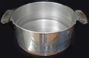
I placed an accelerometer near a stock pot similar to that in Figure
1. I also mounted one on the handle of the pot itself.
My data logger (which Maureen covered in the last post of this series) records
raw data in .csv form, as well as metadata in XML format. I was hoping
to develop a simple model that could tell you the “state of the
pot” based solely upon vibration data, so I used Matlab®
to post-process a number of features from my accelerometer measurements:
- standard deviation
- variance
- kurtosis
- skew factor
- FFT coefficients
- range (max – min values)
-
crossing rate (the percentage at which the signal crosses the mean
value during a given period)
-
cross-correlation between horizontal and vertical components of acceleration
- entropy of raw values
- entropy of some of the statistical measures above
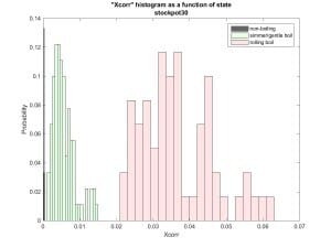
Figure 2 below shows the standard deviation of the vector
magnitude taken over several 30 second runs. This looked
pretty promising!

Figure 2: Standard deviation of the vector magnitude
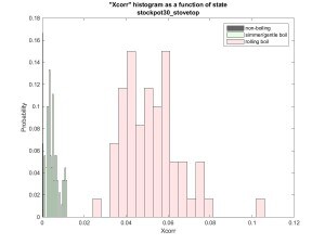
Figure 3 shows the cross-correlation between the vertical and horizontal
components of acceleration. Still good!

Figure 3: Cross correlation between vertical and horizontal vibrations
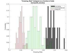
Crossing rates in Figure 4 aren’t bad either.

Figure 4: Crossing rates
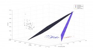
Now if I were to plot these three by state, I can come up with a couple of
planes in the three dimensional space that would
appear to clearly differentiate non-boiling from
simmer from rolling boil.

Figure 5: A 3-dimensional view
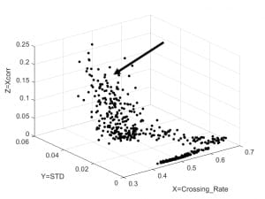
BUT NOT SO FAST! For the data above, I treated the boiling process as if
it had 3 distinct states. In reality, it is a continuous process, which
Figure 6 clearly demonstrates. For that test sequence, I did a
continuous log of data from cold all the way to rolling boil.

Figure 6: It’s really a continuous process
When I looked at Figure 6, I assumed that the area indicated by the arrow was
associated with rolling boil. BUT NOT SO FAST!

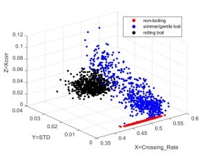
Figure 7: 10 minutes worth of data for each of 3 states
I went back to the kitchen and took three separate data sets, each over a 10
minute period of time and at each of my three desired states. Figure 7
is the result. Rolling boil data turned out to be nicely clustered, with
much more variance in the simmer state. What’s that all about?
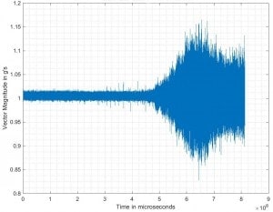
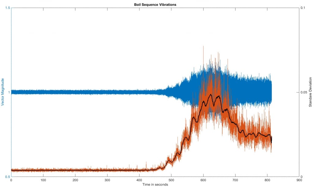
Replotting the vector magnitude versus time for the dataset used in Figure 6,
I got a really interesting result, shown in Figure 8 below.

Figure 8: Vector magnitude versus time
This looks almost exactly like a figure I later found in reference [1],
labeled “Sound pressure signal of cooking process”. Well,
that makes sense. I’m using an accelerometer to measure
vibration, which is just another word for sound. Another way to look at
the data is by computing the standard deviation of a small window moving
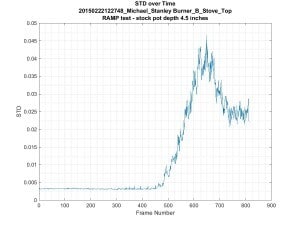
across the dataset of Figure 8. This is shown in Figure 9, and you can
clearly see a peak and subsequent decline to a stable value as the water goes
into a rolling boil state. I see similar shapes in plots for Power
Spectral Density (PSD) log energy entropy, cross correlation, log energy
entropy of the raw signal, variance and range feature types.

Figure 9: Standard deviation of the vector magnitude over time
To find out why, consult Figure 10, which I’ve borrowed from
Wikipedia. It plots rate of heat transfer versus the
temperature of the pan above the saturation temperature Ts.
The downturn in Figures 8 and 9 corresponds to the “transition
boiling” region of Figure 10. In this area, we’re just
starting to see a phenomenon known as “film boiling”. When
this starts to occur, our system becomes less efficient at transferring
heat. The curve levels out once film boiling dominates over nucleate
boiling (which I’ve referred to as “simmer”).

Figure 10: Heat transfer for water 2
Great! At this point we have data which matches known theory. We
should be ready to model our system. BUT NOT SO FAST! Just how repeatable is
this?

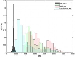
Figure 11: Standard deviation of the vector magnitude – Diversified!
State dependency in Figure 11 isn’t nearly so straight forward as we
hoped in Figure 2. Here I’ve included more datasets.
I’ve also included data from sensors located near other burners on the
stove. These are labeled “none” above, because there was
no pot on the adjacent burner. But in many cases, we still got vibration
– from the pot across the stove!
Things are not so pretty any more. Plots for cross correlation and
crossing rates show similar overlap between states.
So what have we learned?
-
Don’t generalize from small sample sets. Get lots of data.
-
Have you considered all variables that can affect your system? For the case
above, what happens if we’re cooking soup, pasta
or reducing cream? What about stove type, size and
number of burners, boil state, pot type, pot size, burner size, etc.
All of these must be recorded with your sensor data.
-
Although I didn’t mention it above, make sure you record the metadata
for each run correctly. Data entry errors in your logger form can be
painful to correct later on.
-
Look at your data from lots of perspectives. I refer to these as
“features”. Think standard deviation, crossing rates,
entropy, etc. Matlab is your friend when it comes to this kind of
visualization.
-
Be sure you understand what your data is telling you. The addition of
state information to Figure 7 completely changed the way I was interpreting
Figure 6.
-
Do not make assumptions on the form of your model. I had hoped to take
a vibration measurement, do some calculations and tell you which of three
states the system was in. But figures 8 and 9 clearly show that the
same value on the Y axis can correspond to two different states.
That’s the same as saying we have overlapping states in the histogram
of Figure 11. To clearly differentiate between the three states,
we’re going to have to introduce an assumption of continuous heating
and time as a variable.
-
Consider how you are going to normalize your data. For the problem
above, you’ll see fairly dramatic changes in signal magnitudes as a
function of pot shape, size and composition. More water (mass)
in the pot probably implies a better mechanical coupling to the stove, etc.
-
Make sure you can gather data for all expected states of the system.
Also make sure you gather data for cases of “interfering
stimulus”. In the case above, what if someone stirs the
pot? Or adds another pot to the stove top?
-
Research prior art. There’s no need to reinvent the
wheel. Also, think about related areas. When I dug into the
topic of predicting boiling state from vibration data, I found relevant
material dating back to the 1960s – for monitoring the
state of cooling systems for nuclear reactors.
I’m not done with this problem just yet. I am seeing some data
signatures that should help me differentiate between burners on a stove
top. And I need to find the most robust method to identify the entry to
the transition boiling region. And don’t even ask me about
spaghetti sauce!
Afterward
After submitting my initial draft of this post, I went back to a slightly
revised version of Figures 8 and 9. I then computed a moving
average of the standard deviation. The three are combined in Figure 12.

Figure 12: Raw data, standard deviation and moving average of the standard
deviation
The black line is the moving average (100 samples) of the standard deviation
(each in turn computed using 64 samples of the original data). You might
wonder about the cyclic signal that seems to be superimposed on it in the
“simmer region”. I did too. Then I thought back and
remembered that my stove cycled power to the burner on and off 2 to 3 times a
minute during parts of my data collection. That appears to correlate
with what we are seeing here. So just using a 3-axis accelerometer,
we’ve been able to tease out when water starts to simmer, enters
transition boiling, goes into full rolling boil, AND the cycling period of the
stove it was heated on.


